Bekrija is a family-owned distillery from Slavonia with an ambition to create premium spirits that combine local heritage with contemporary production, precision, and uncompromising quality. Rooted in a region with a long tradition of fruit growing and distilling, the brand represents a new generation of Slavonian producers seeking to position their products alongside leading international spirits.
The premium rakija market has grown significantly in recent years, yet much of the category still relies on familiar visual conventions, traditional motifs, and rustic aesthetics. The challenge was to create a distinctive name and packaging system that would maintain an authentic connection to Slavonian culture while moving away from the expected visual language of traditional rakija brands. The system also needed to establish a strong shelf presence, clearly differentiate individual products, and provide a flexible foundation for expanding the portfolio.
The project began with naming. Bekrija draws from a distinctly Slavonian archetype: a cheerful, sociable character associated with good company, hospitality, and the enjoyment of life. Rather than referencing tradition through expected folklore motifs, the name carries the cultural connection and allows the visual identity to take a more contemporary direction.
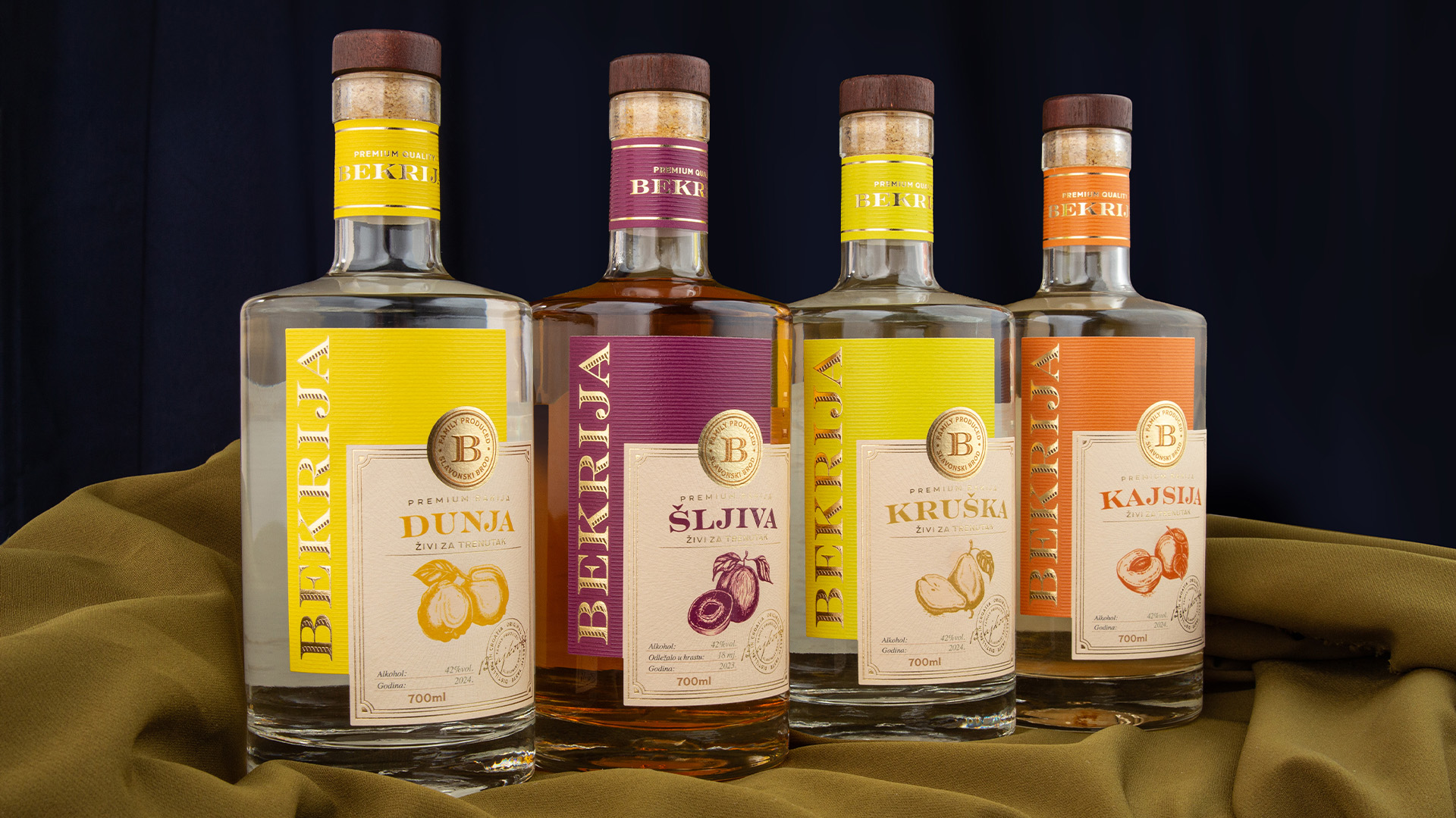
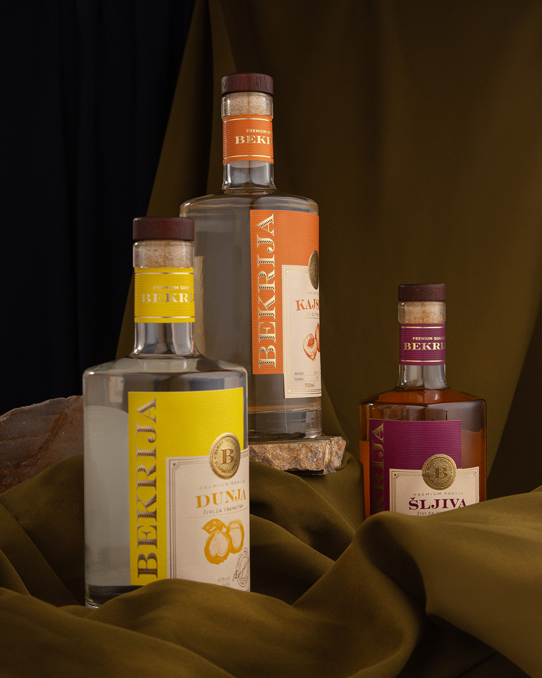
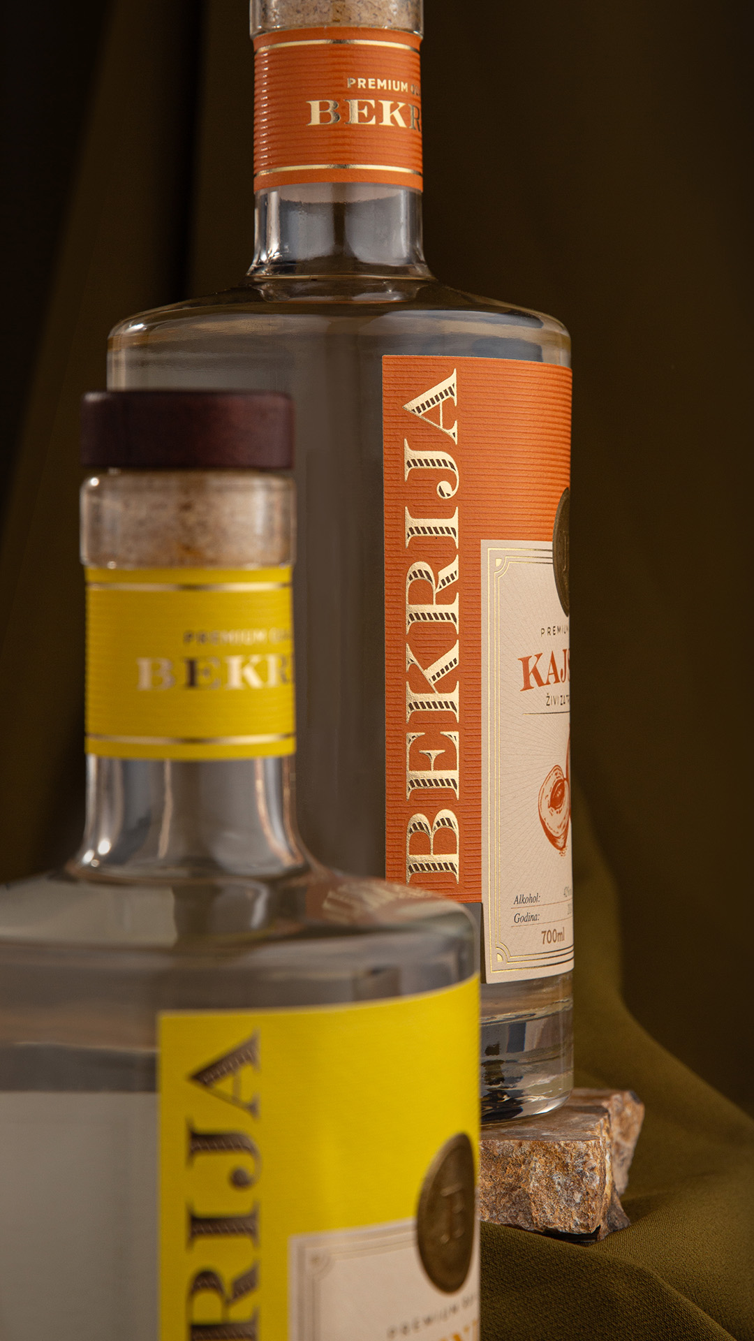
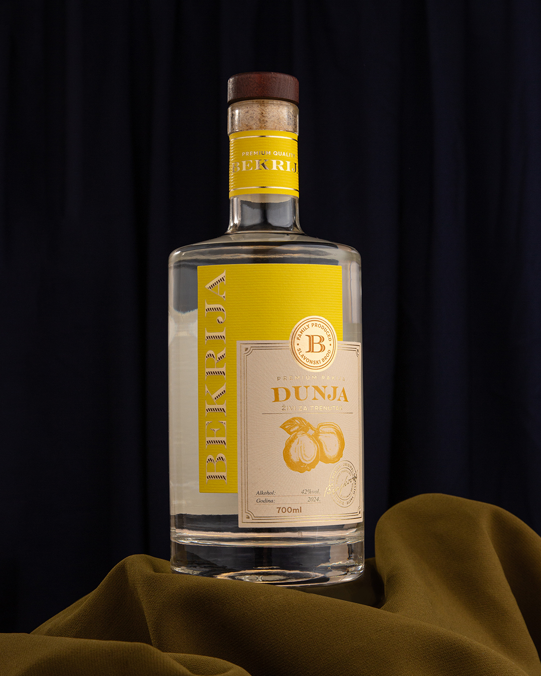
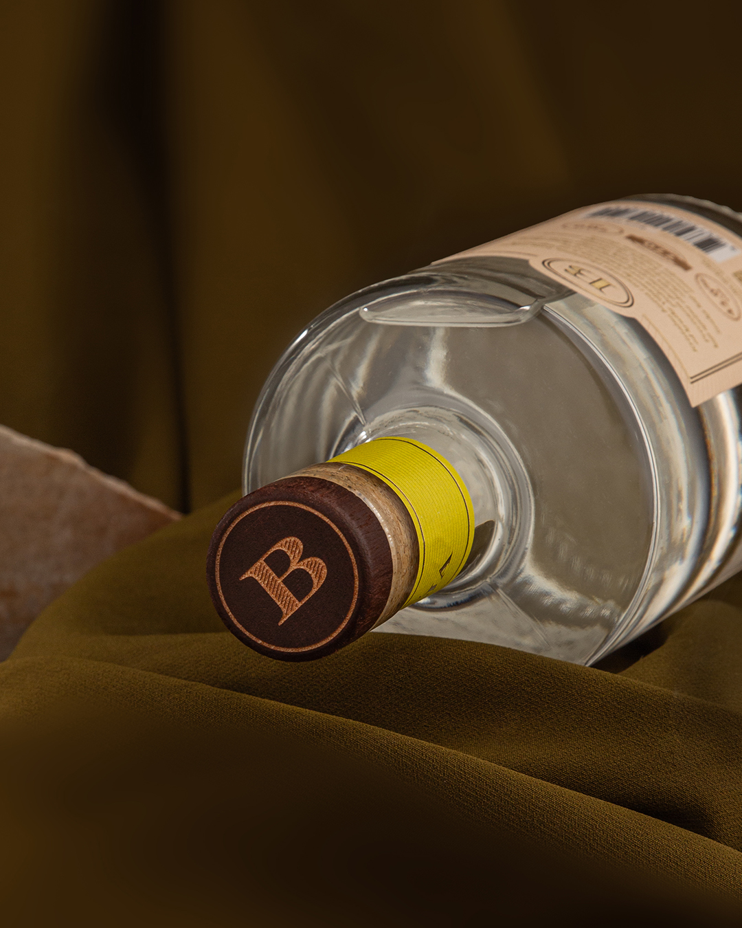
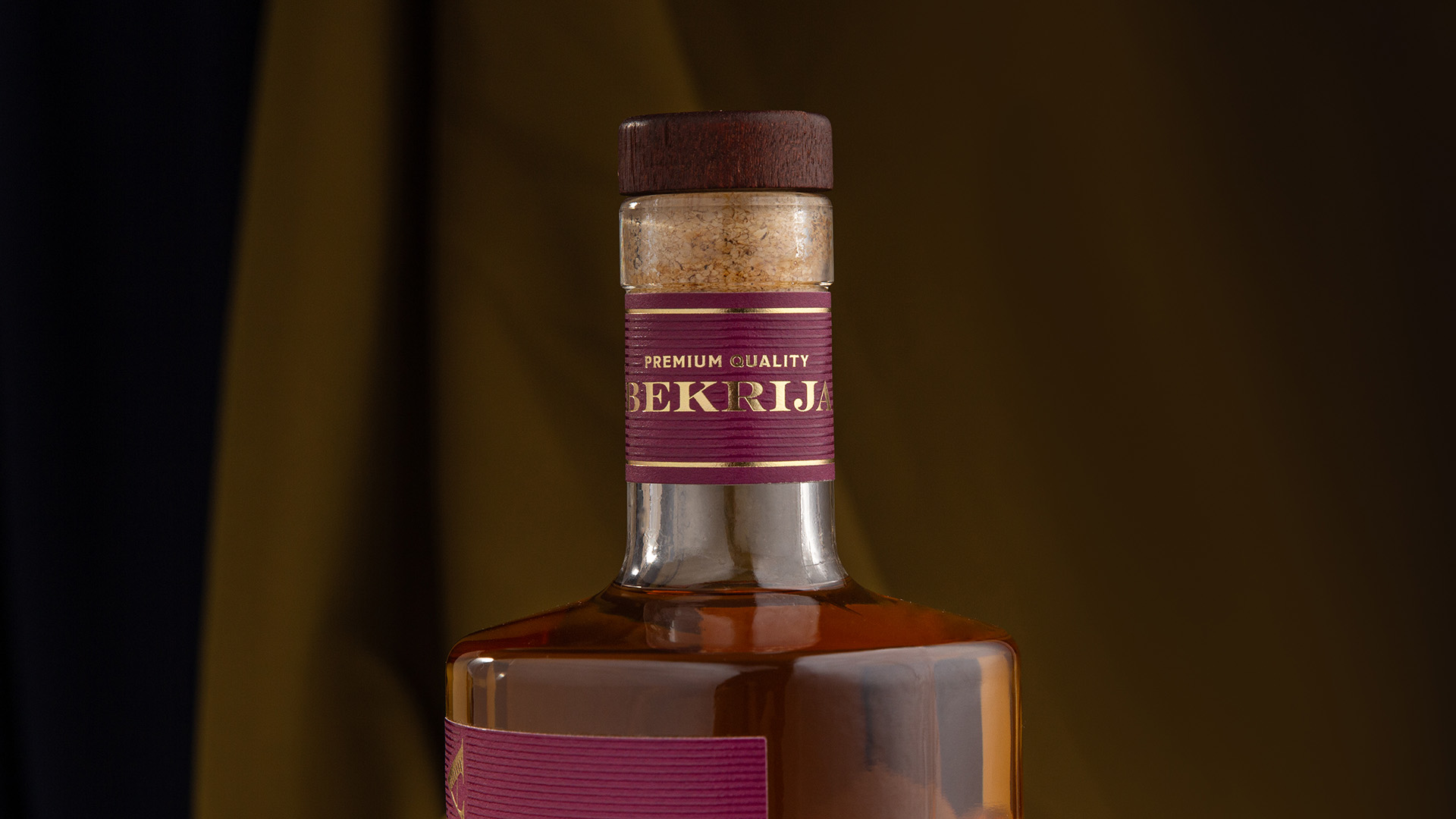
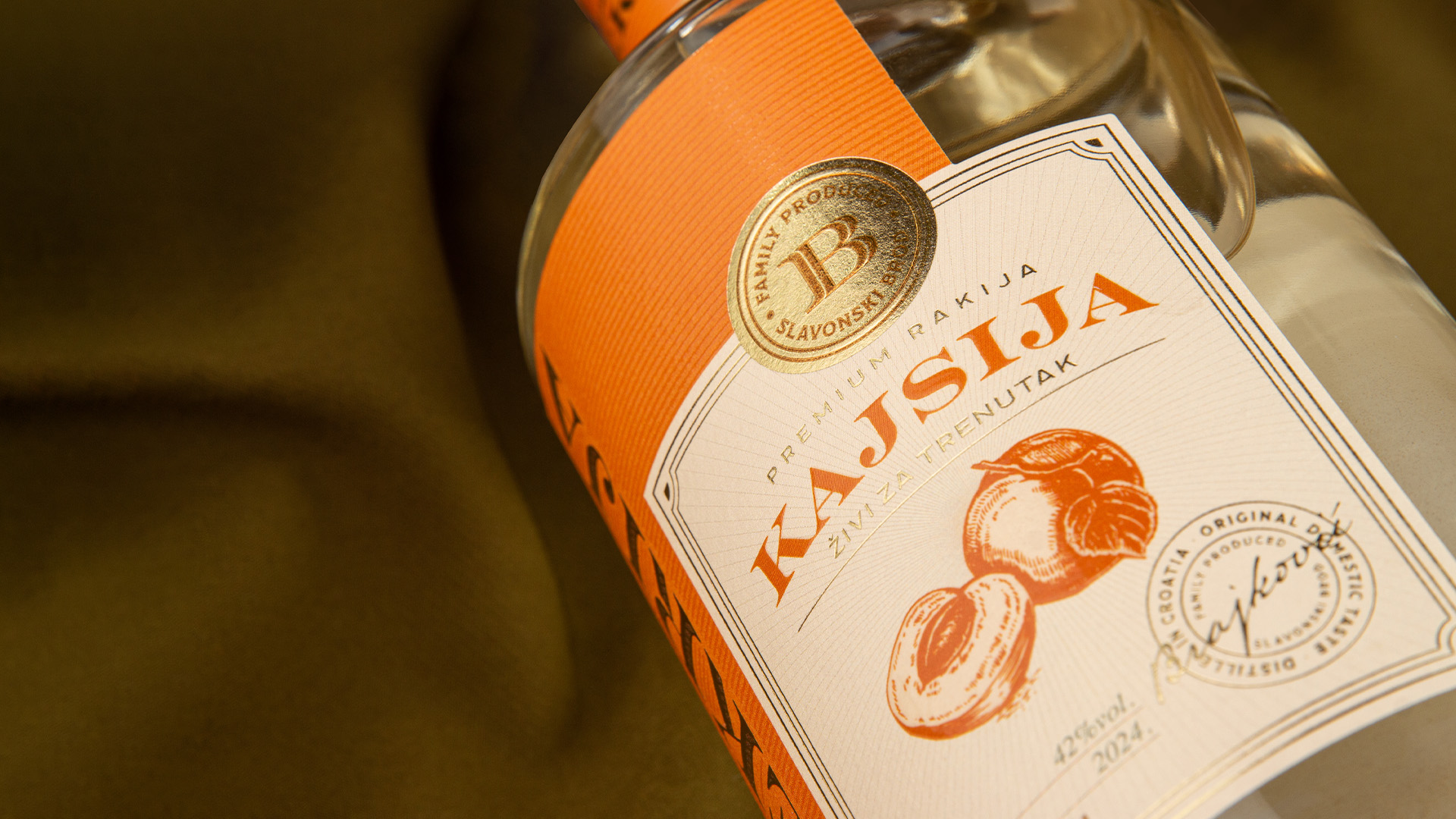
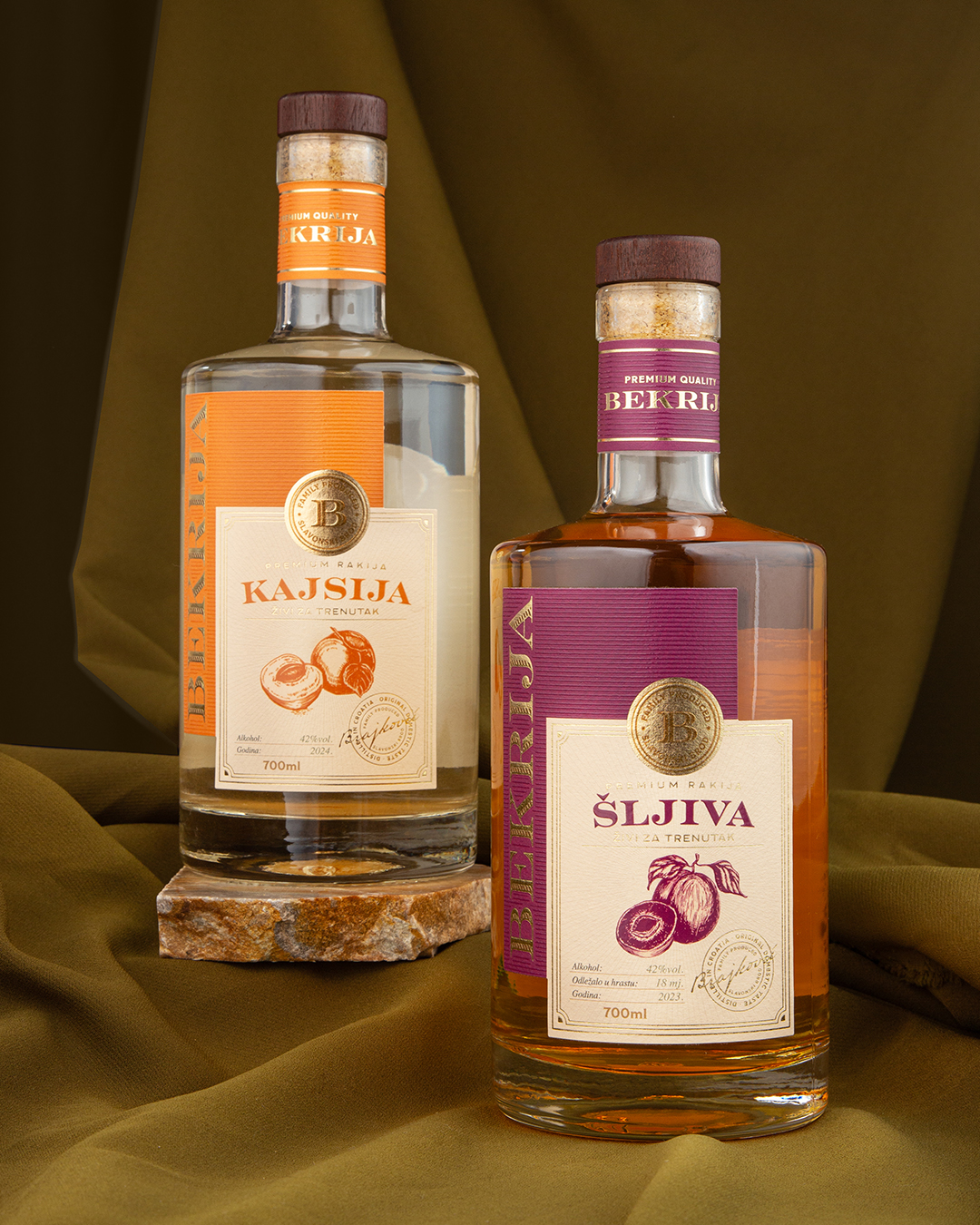
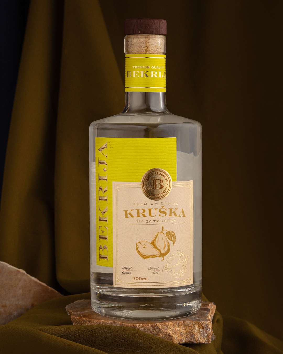
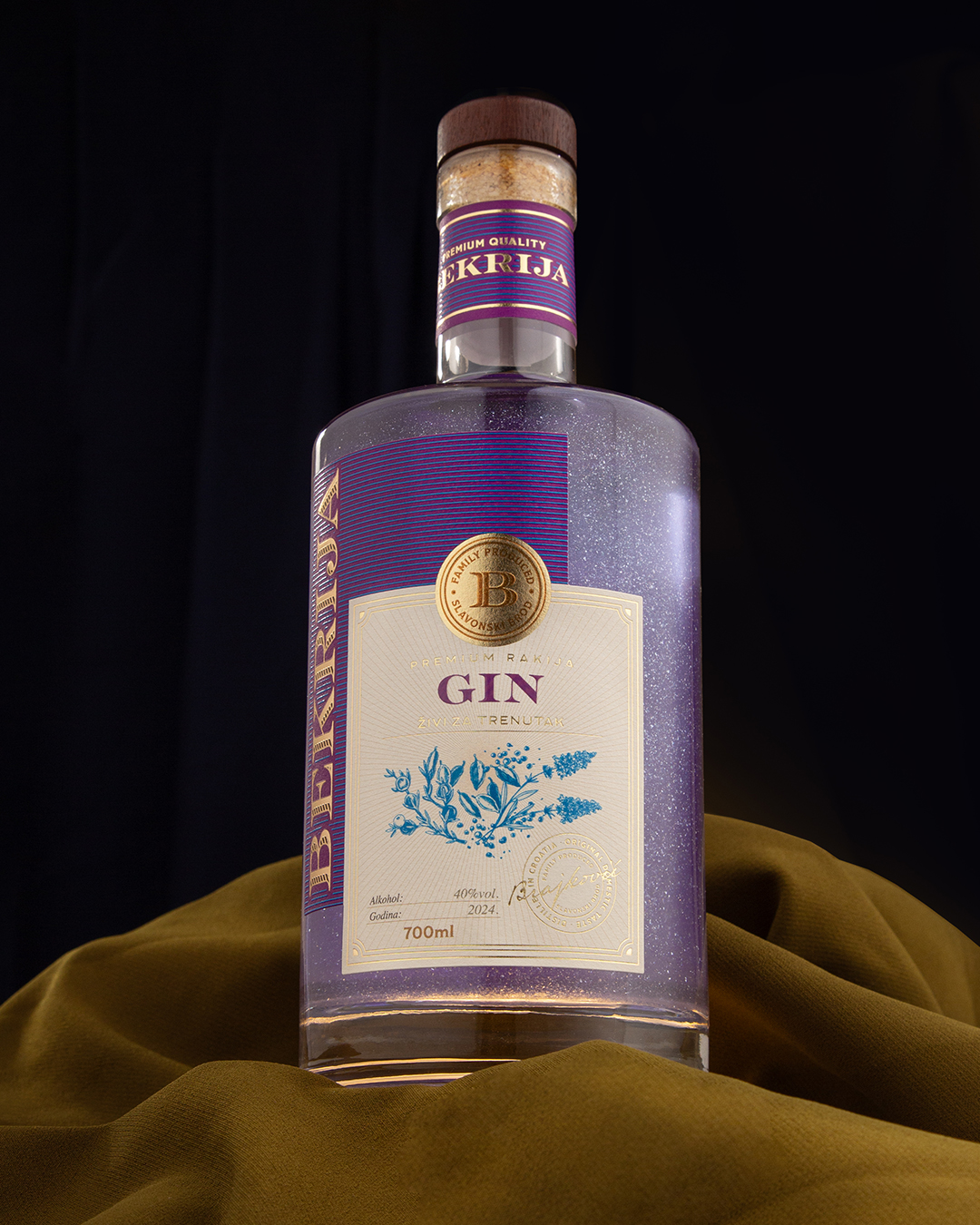
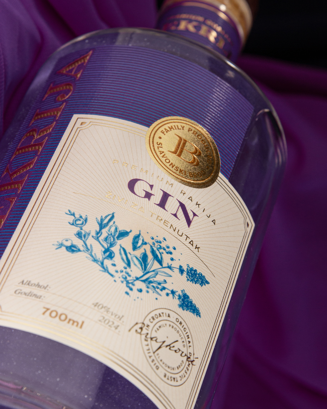
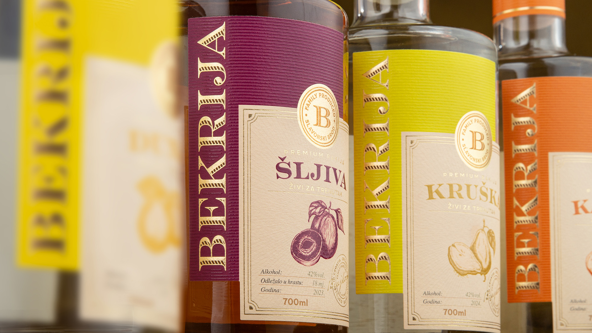
The packaging was developed as a flexible system spanning fruit brandies and gins. Each product is distinguished by a colour inspired by its primary fruit or ingredient, creating intuitive differentiation while maintaining a strong family resemblance across the range. A restrained graphic language combined with textured papers, embossing, and gold foil gives the packaging a refined tactile quality. The result is an identity that brings Slavonian character into a contemporary premium spirits category without relying on visual nostalgia.