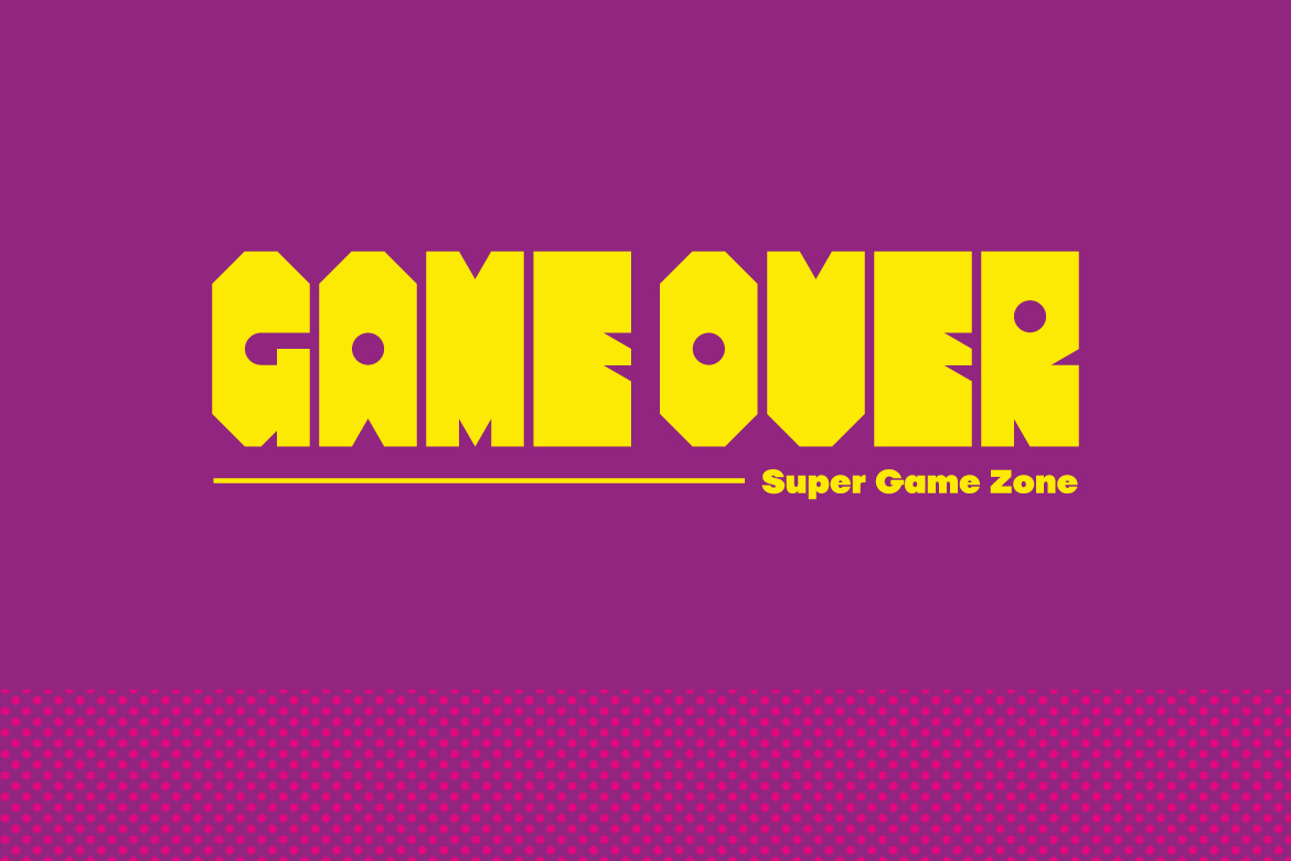
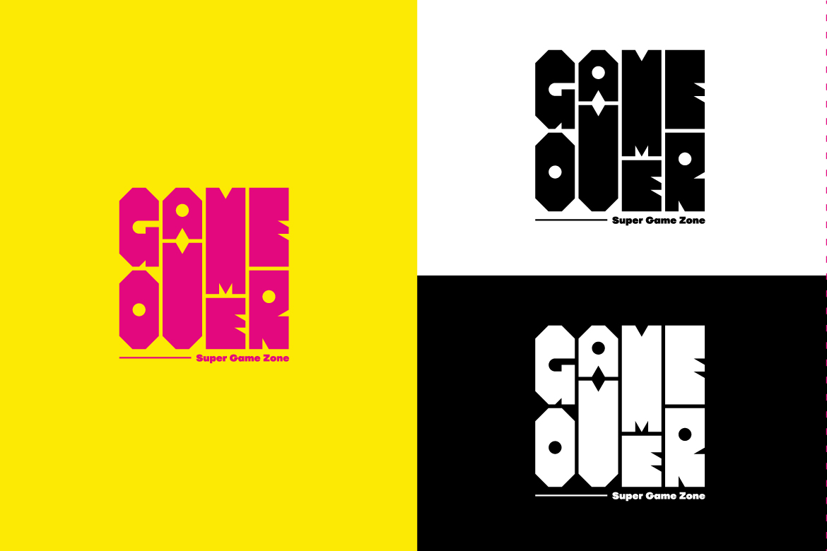
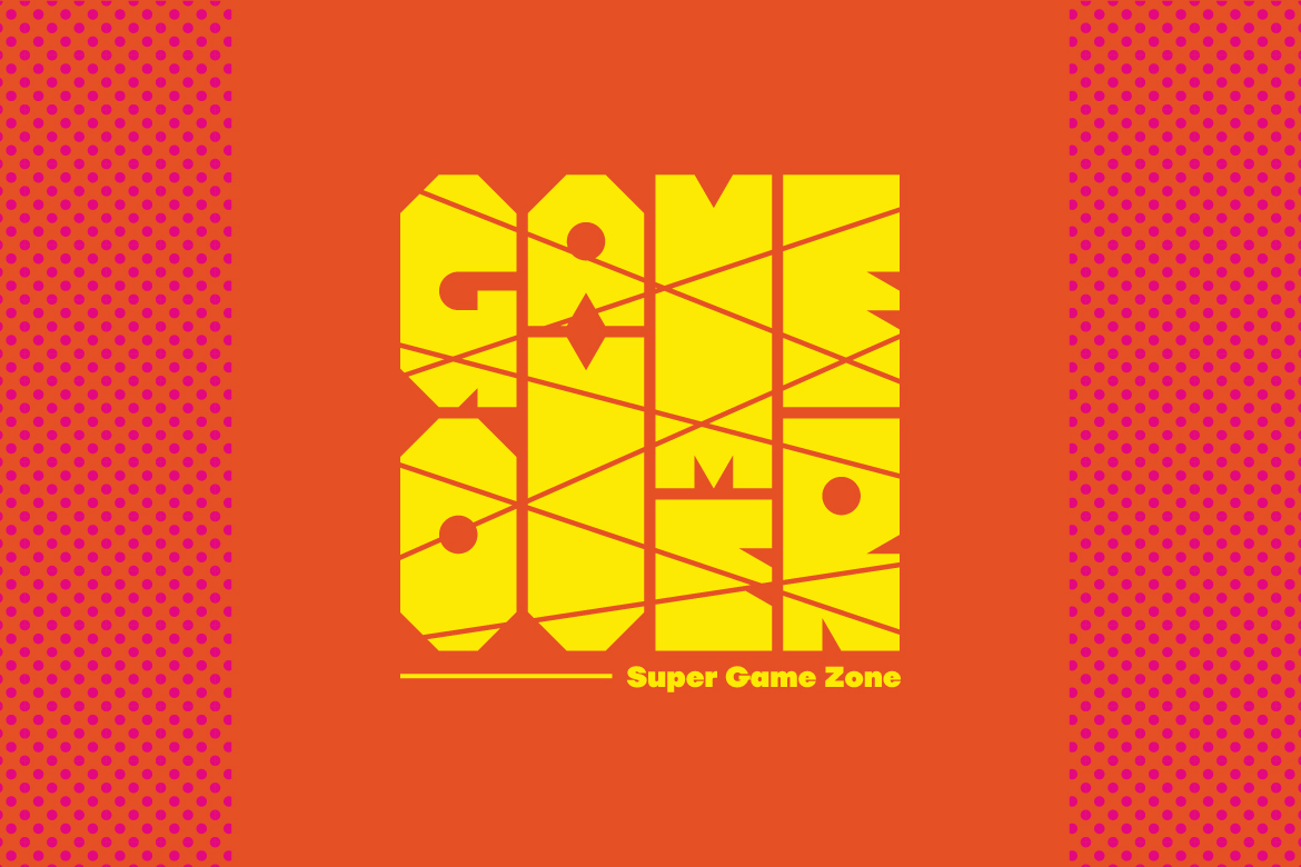
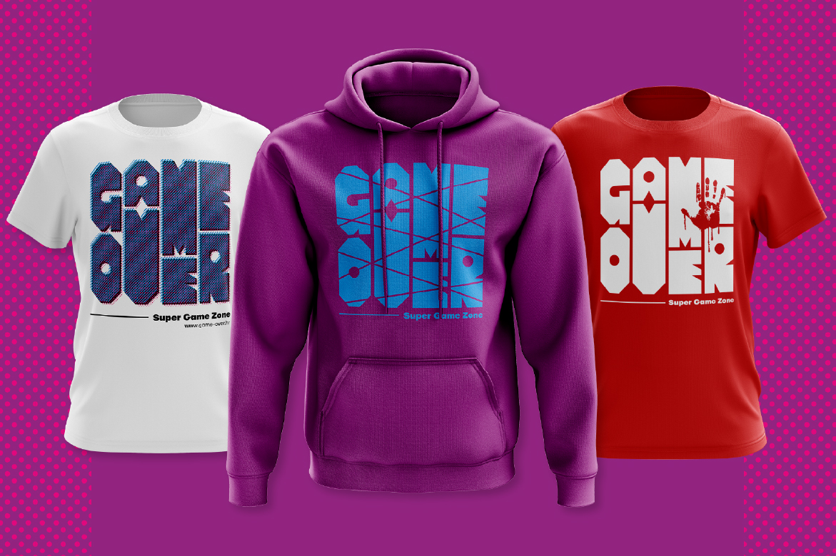
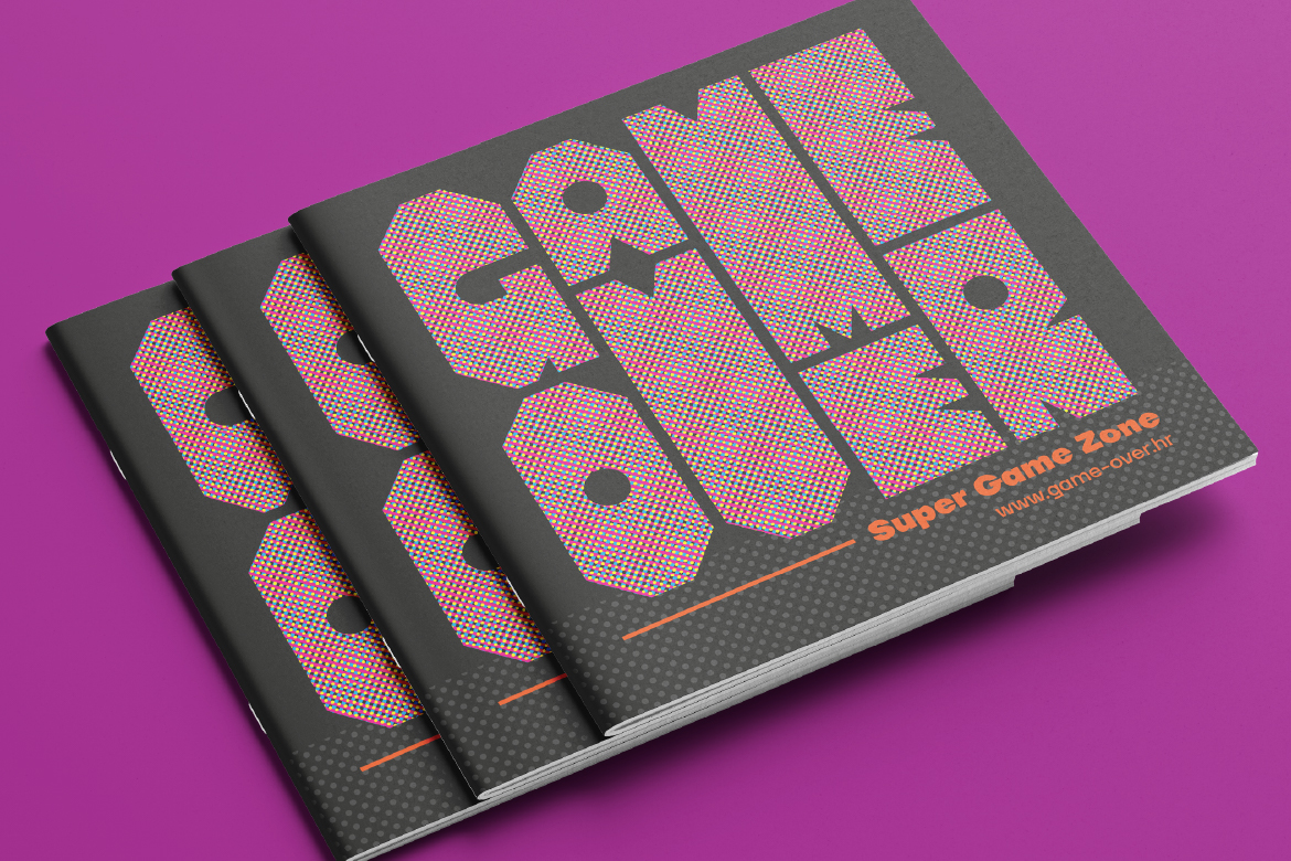
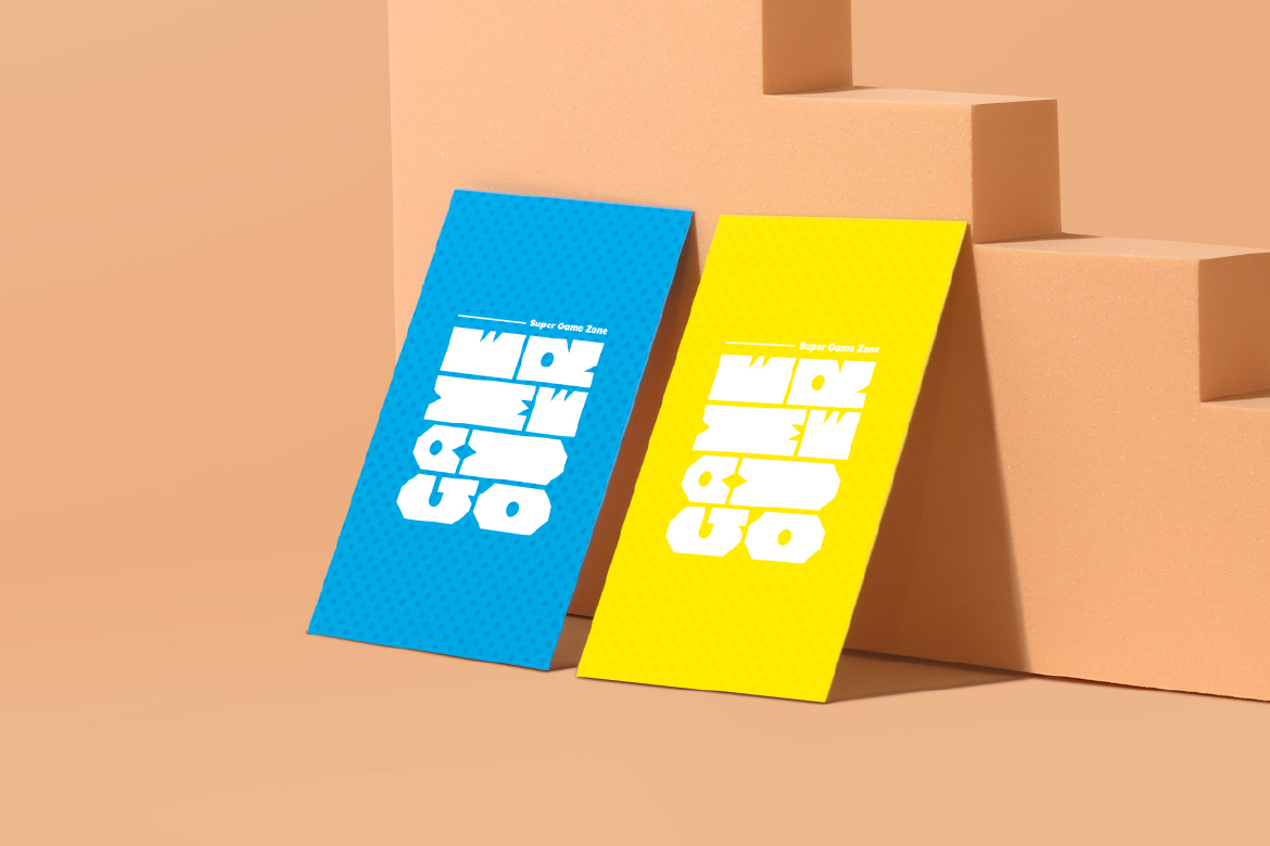
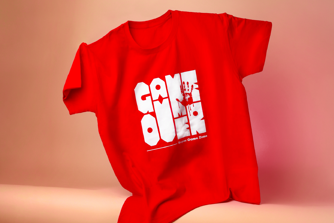
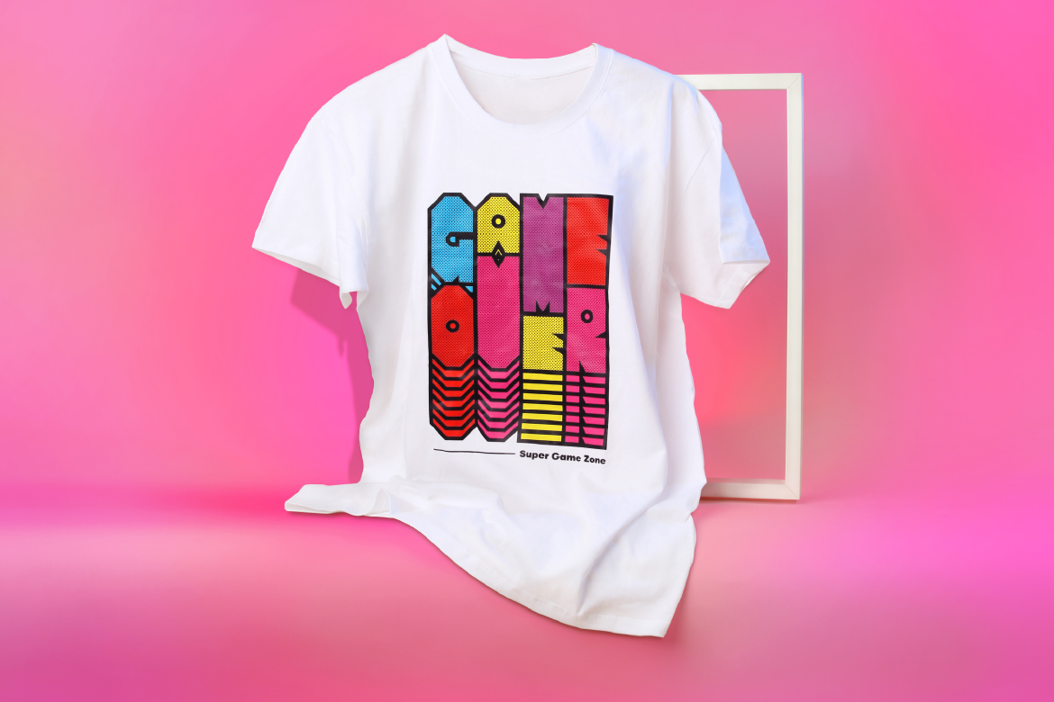
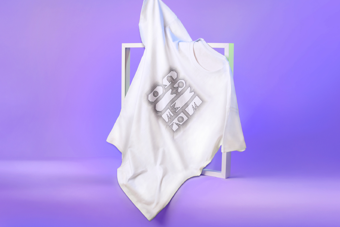
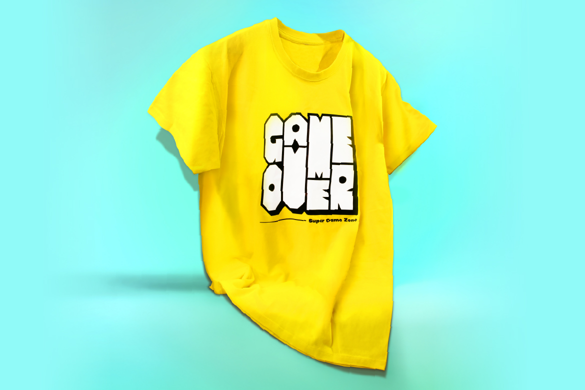
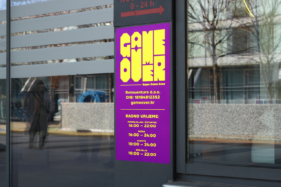
Inspired by the aesthetic of classic arcade games, we developed a modular logo built on a strict grid system. Each letter functions as an independent visual block, allowing endless flexibility for combining, repeating, and adapting across formats and contexts.
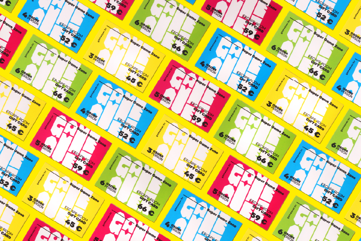
The design features bold colors, pixelated patterns, graphic textures, and contrasting palettes, creating a vibrant visual language that evokes gameplay, movement, and digital energy.
The typographic form balances retro charm with a contemporary edge, appealing to both nostalgic gamers and new generations.
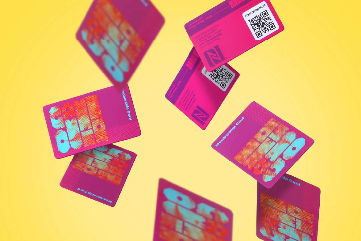
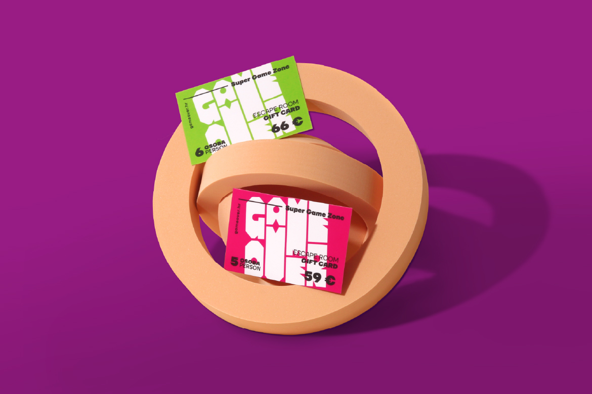
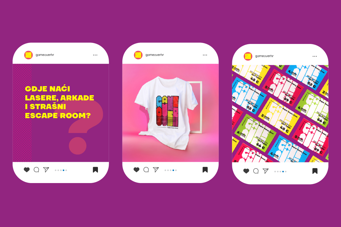
The logo system works seamlessly across physical applications (posters, signage, wall graphics) and digital media (web, social networks, interactive screens), creating a scalable identity that evolves alongside the Game Over brand – while preserving its recognizability and visual consistency.