Hikori is an independent software engineering consultancy specialising in frontend development, application modernisation, and digital product development. The company works with technology businesses, digital agencies, and development teams seeking specialised expertise and a reliable partner to solve complex technical challenges.
Our task was to create a name and visual identity for a new software consultancy, establishing the foundations for a distinctive brand with international ambitions.
The challenge was to communicate technical expertise, precision, and clarity of thinking while moving beyond the familiar visual conventions of the technology industry. The brand needed to feel professional and trustworthy, yet expressive enough to establish a character of its own.
We created Hikori, an original name inspired by Japanese linguistic associations with movement, progress, and logic. The name brings together agility and speed with a considered approach to technology, where understanding complex systems comes before simplifying them. Short, memorable, and internationally accessible, it became the starting point for the brand identity.
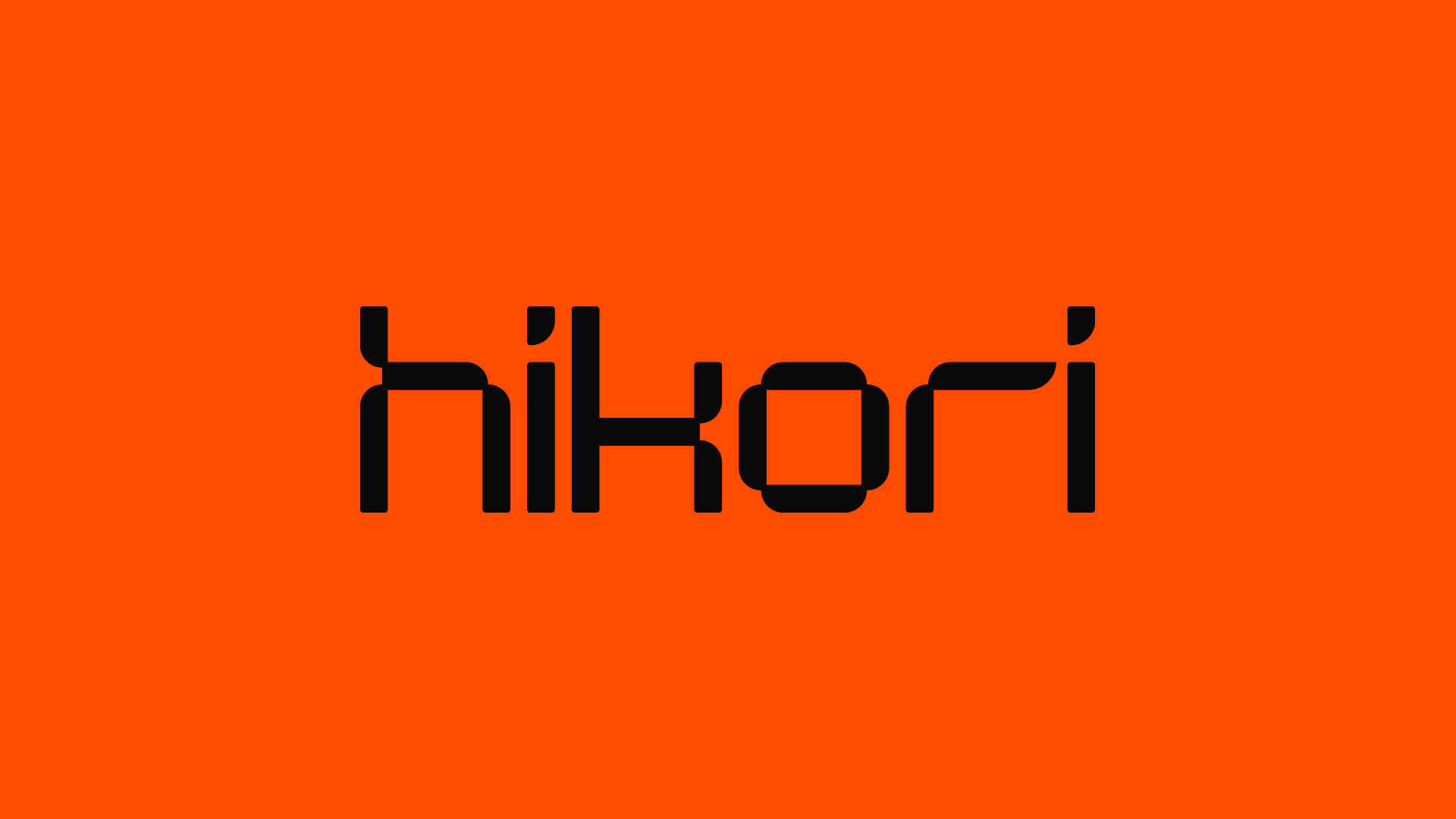
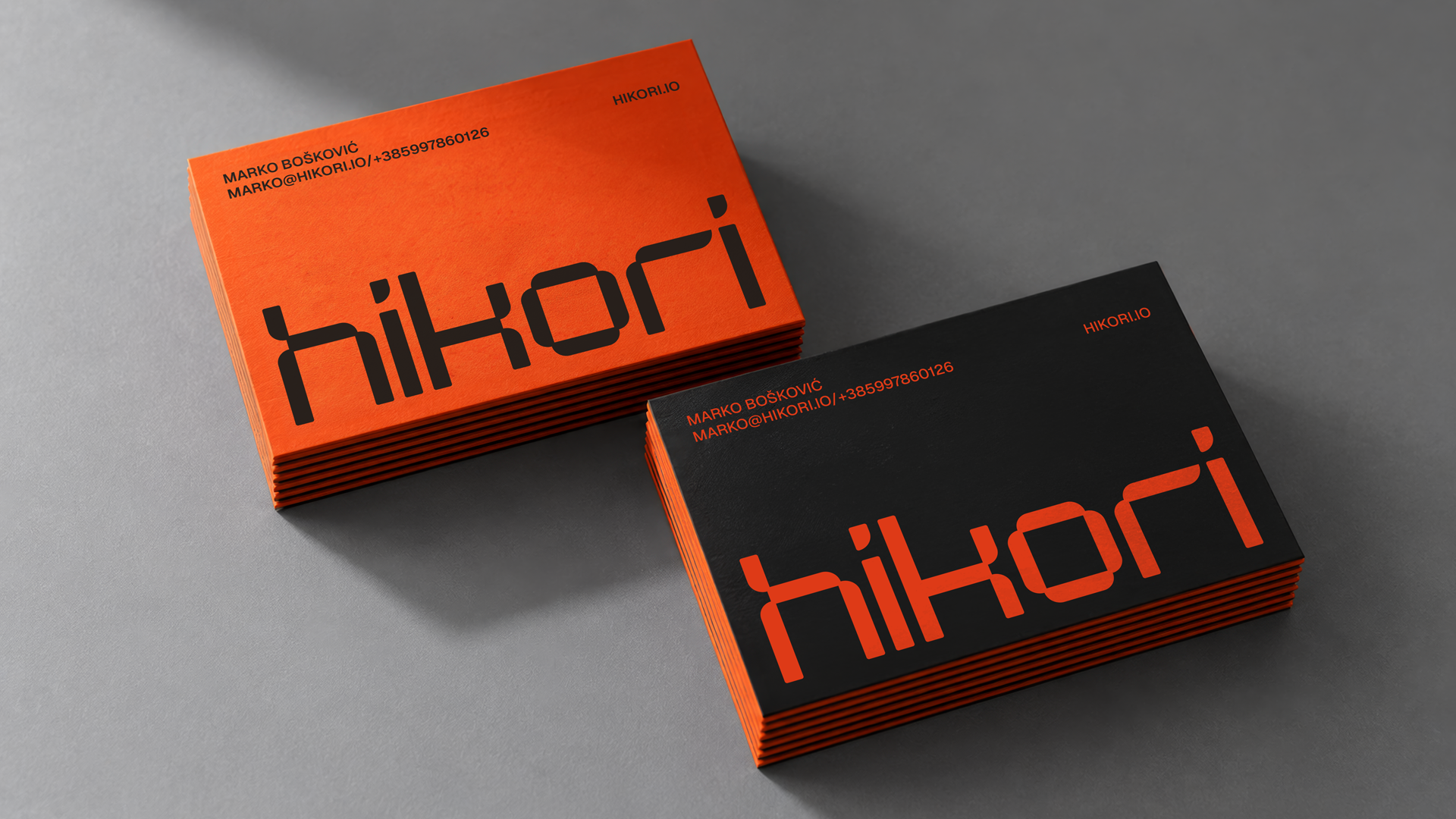
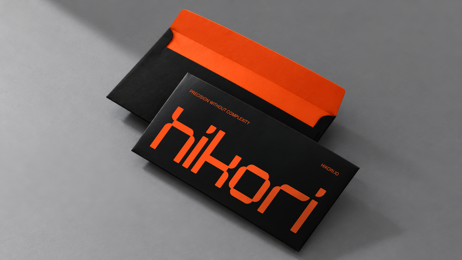
At the heart of the visual identity is a custom-designed geometric wordmark, with distinctive letterforms that give the brand its recognisable character. Paired with a bold orange and black colour palette, the result is a simple yet expressive identity that moves away from the expected aesthetics of the technology sector.
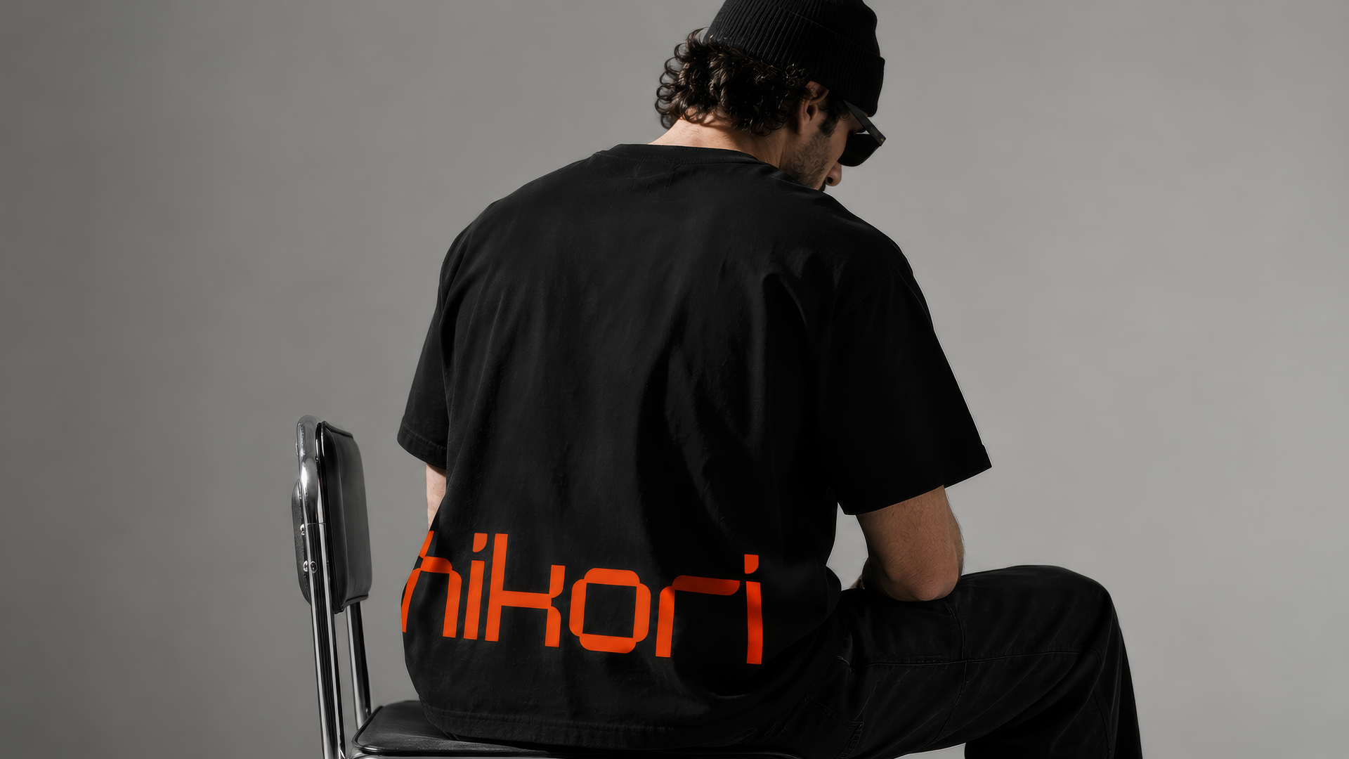
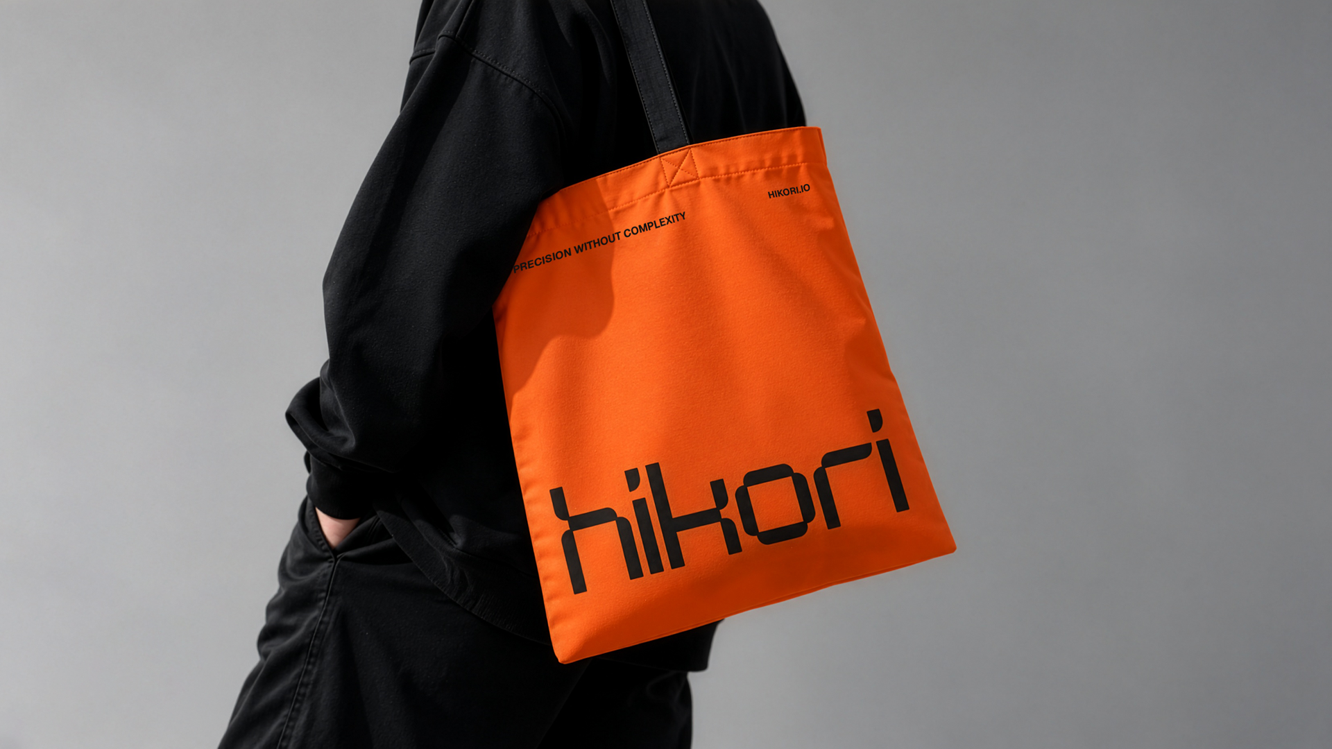
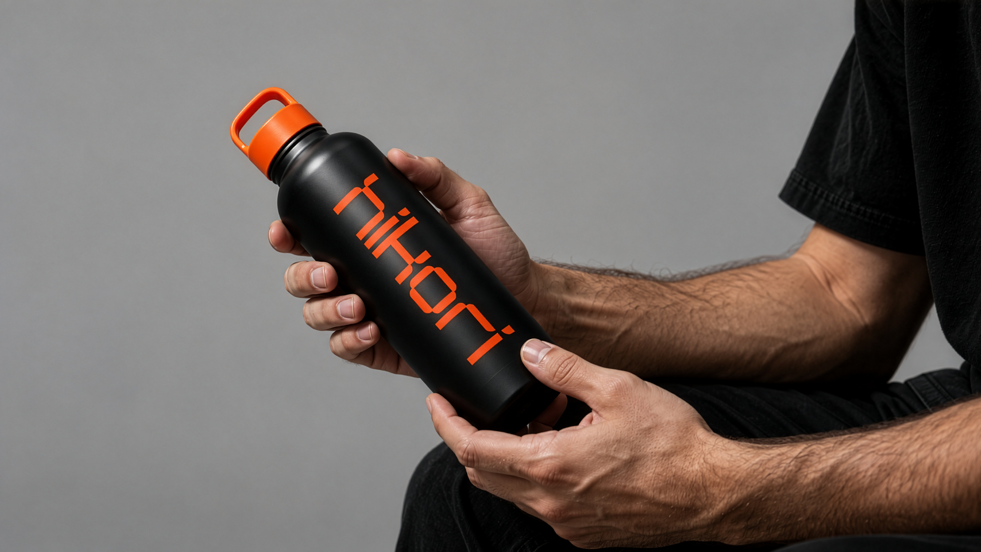
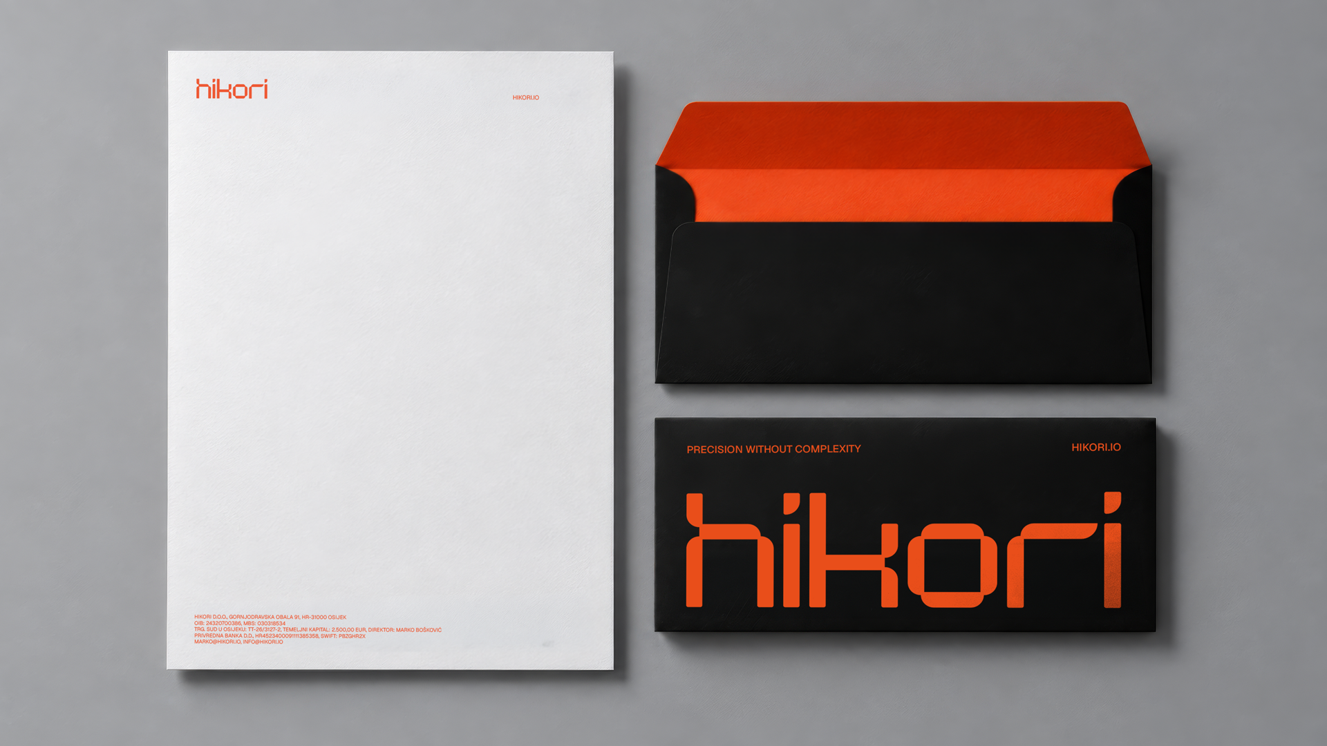
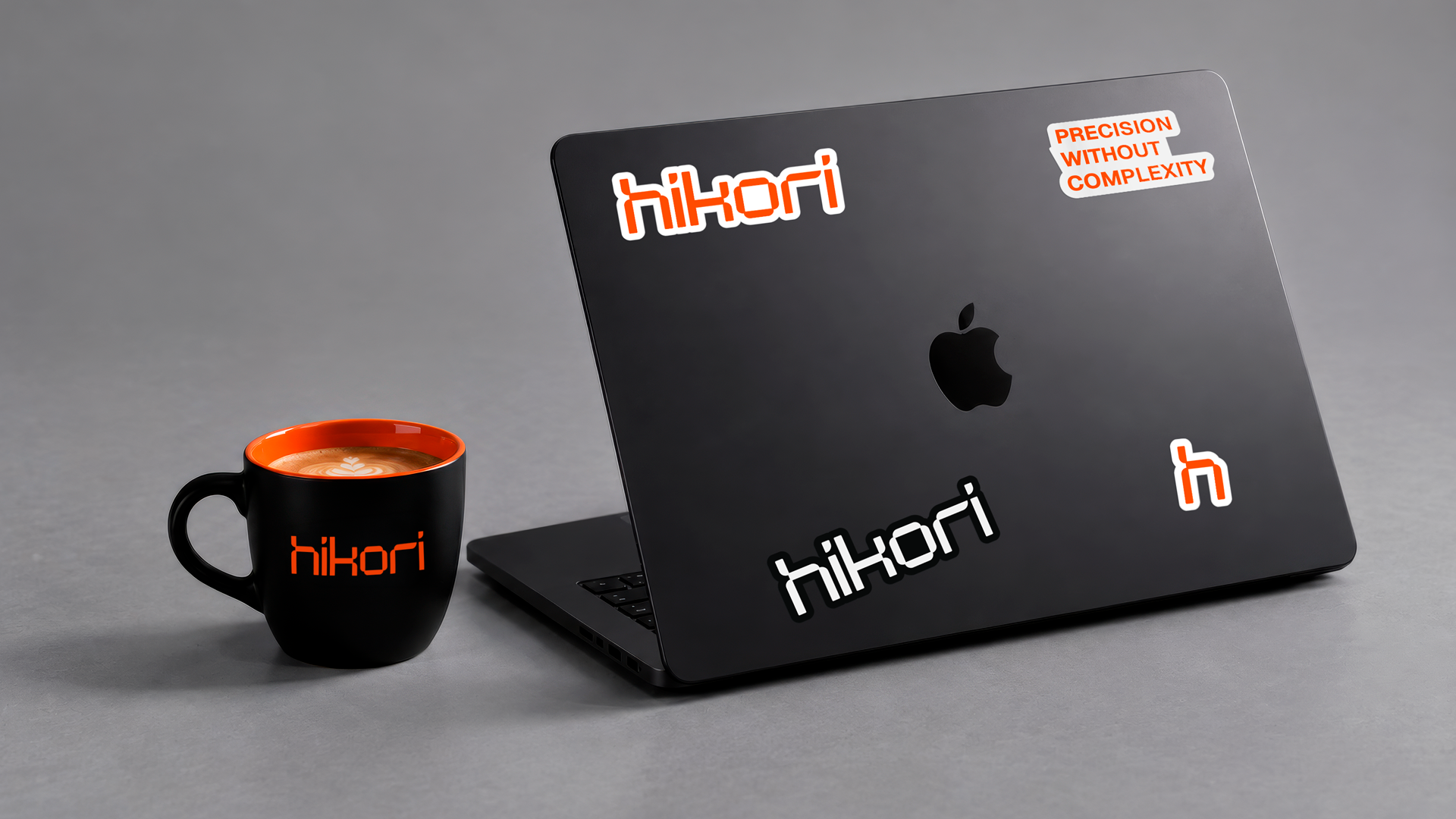
The identity extends into a consistent visual system across digital communications, business stationery, and promotional materials. Together, the name, typography, and visual language reflect Hikori’s approach to technology: precision without unnecessary complexity.