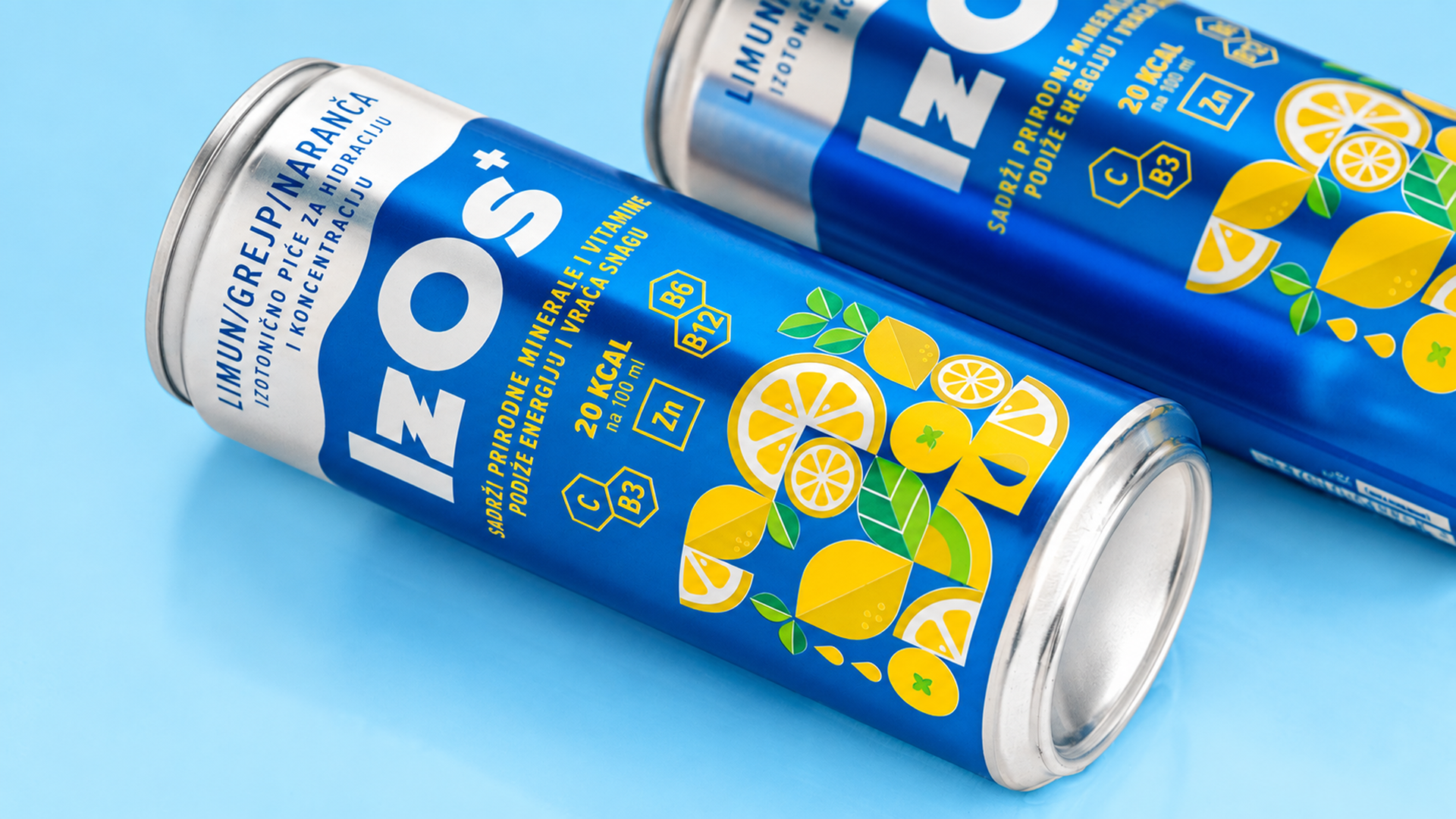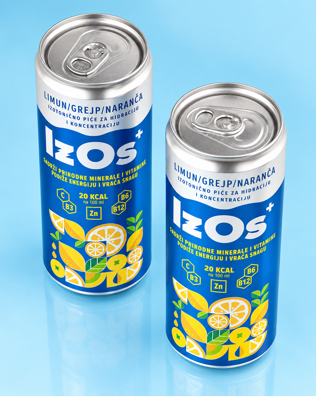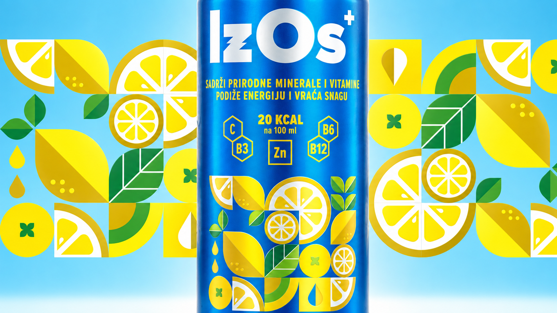
Osječka pivovara is one of the most recognizable names in Osijek and Slavonia, with a long brewing tradition and strong ties to the local community. As its portfolio expands beyond established beer brands, IzOs introduces a new category: a modern isotonic drink developed and produced in Osijek.
The name itself reflects its origin, combining IZotonic with OSijek. The first product combines lemon, grapefruit and orange in a refreshing citrus flavour designed for an active, everyday lifestyle.
The challenge was to create the identity and packaging for an entirely new product and establish a distinctive presence within a highly competitive beverage category. The design needed to communicate freshness, energy and the citrus character of the drink while appealing to a contemporary, active audience.
Beyond launching the first product, the identity needed to establish a recognizable and flexible visual system that could evolve as IzOs expands into new flavours and a broader product range.
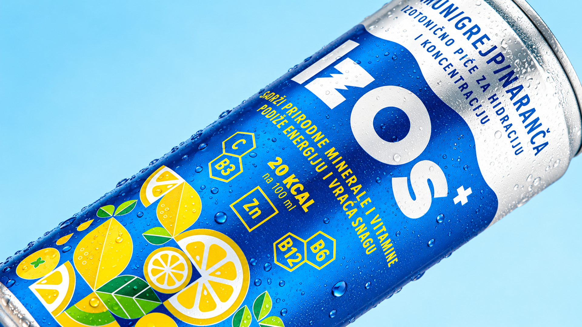
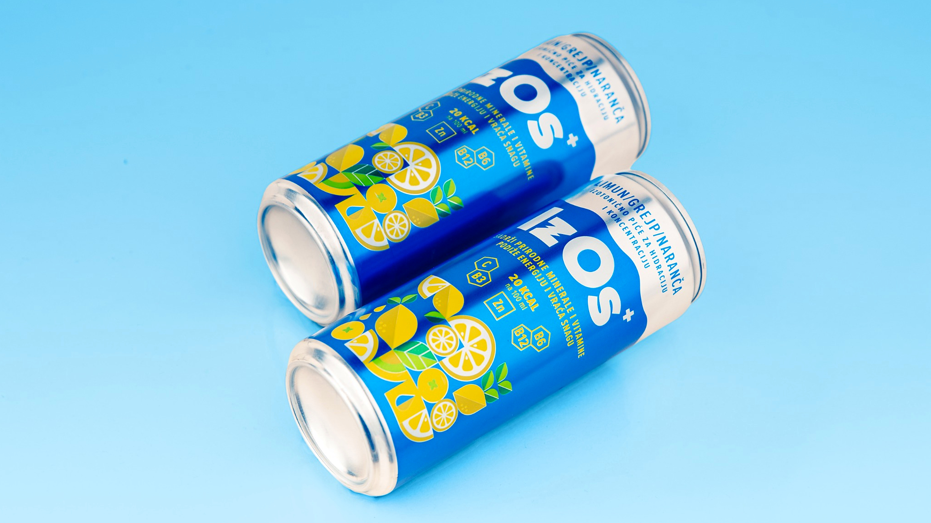
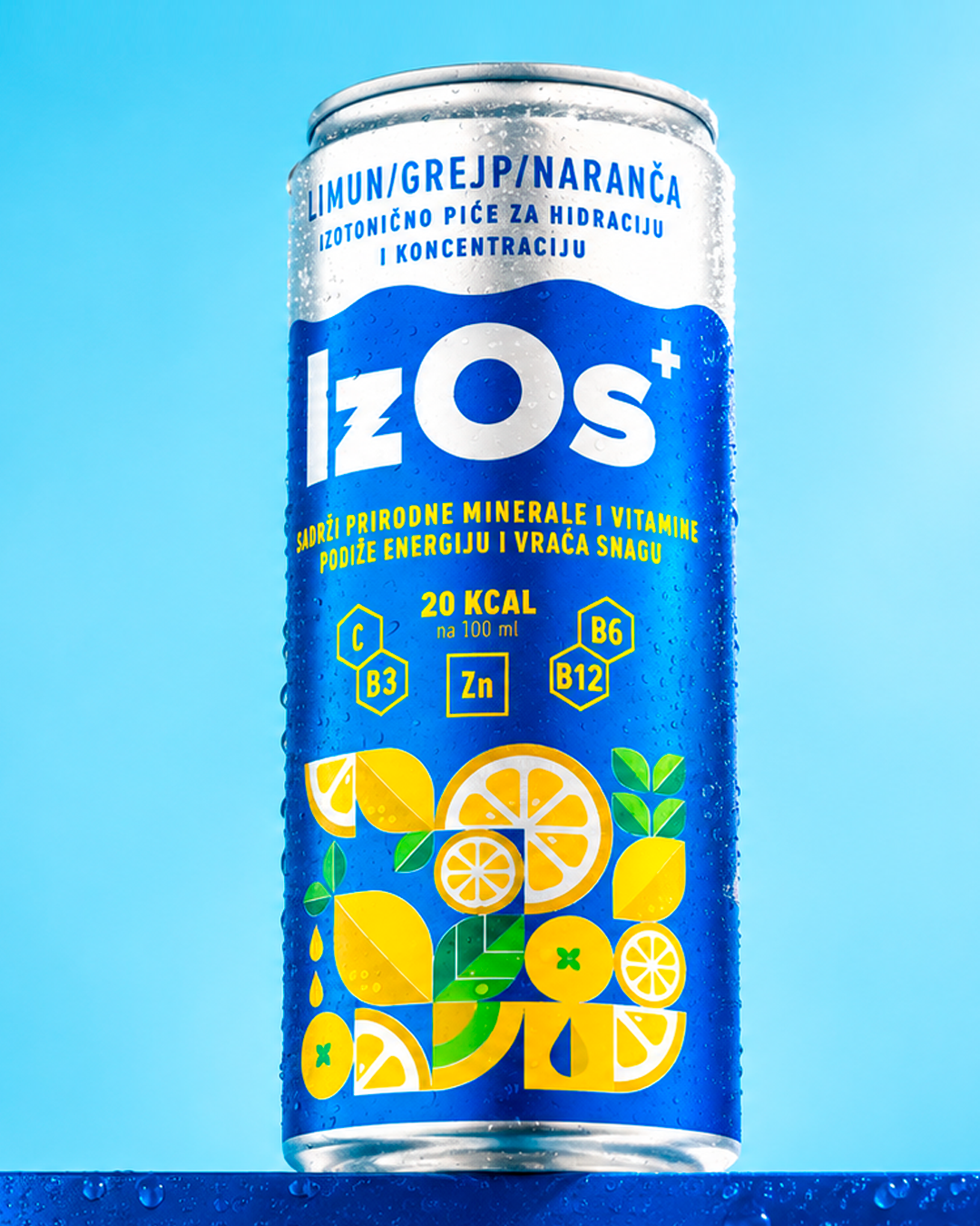
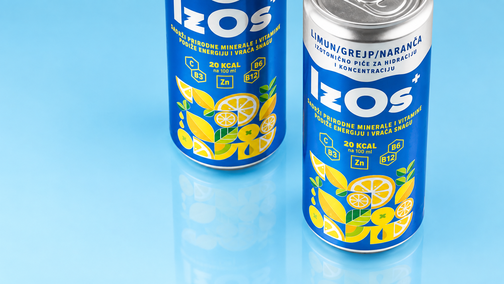
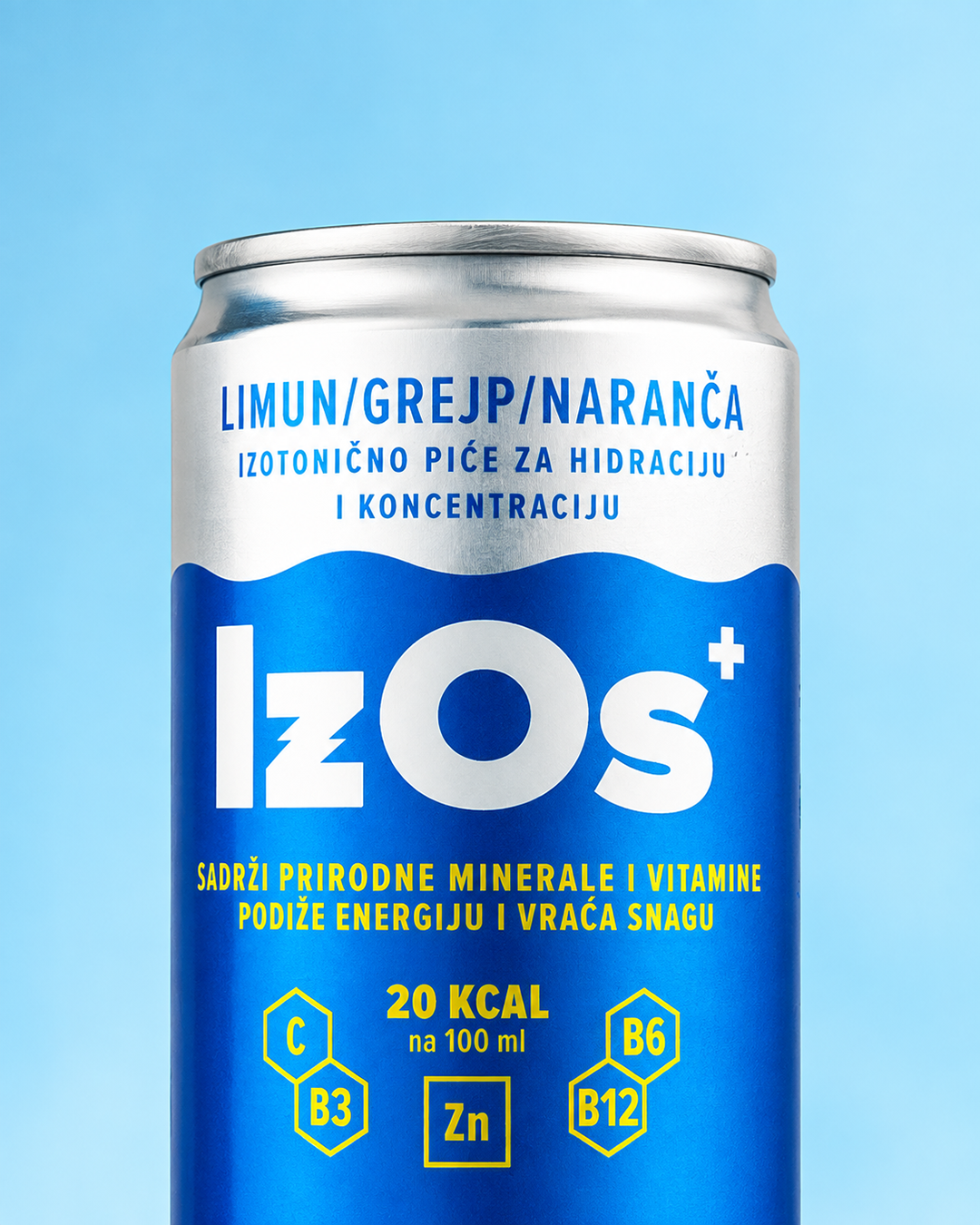
We built the identity around the product’s key qualities: freshness, lightness and energy. Bold typography and a prominent IzOs wordmark form the core of the system, giving the brand a direct and confident presence across the packaging.
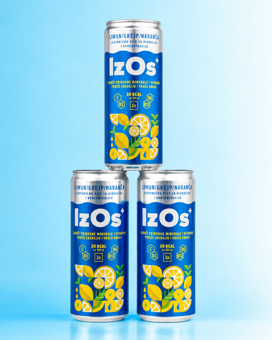
A vibrant colour palette, expressive illustrations of lemon, grapefruit and orange, and dynamic graphic elements translate the citrus flavour into a bright and energetic visual language. The expressive elements are balanced by a clear information hierarchy, keeping the packaging simple and easy to navigate.
Rather than designing a single package, we created the foundation for a flexible identity that can adapt to future flavours while maintaining strong brand recognition. The result gives IzOs a distinctive presence today and a visual system designed to grow with the product range.